Evaluation in dStudio
The Evaluate view - a basic understanding
In this section you can see how well the images from the evaluation dataset are classified by the neural network. The so-called "confusion matrix" shows the 'Prediction' of the network compared to the label it was given in the beginning (the 'Ground truth').
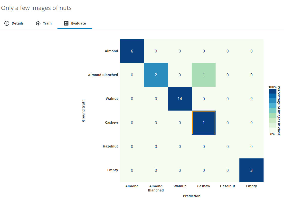
From this result you can read how accurately the neural network can deal with the given task and also see specific example images that were possibly wrongly classified.
In this example almost everything was predicted correctly, but one Almond Blanched was predicted as a Cashew. You can click a cell in the matrix to see its related images.
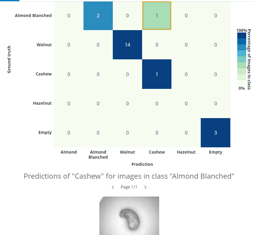
In this case, we can see that the issue was not that the image was incorrectly classified by the network - the issue was that the image had been incorrectly labelled by the annotator. It is possible to click on the image and change annotations. We want to change the classification class to Cashew instead of Almond Blanched.
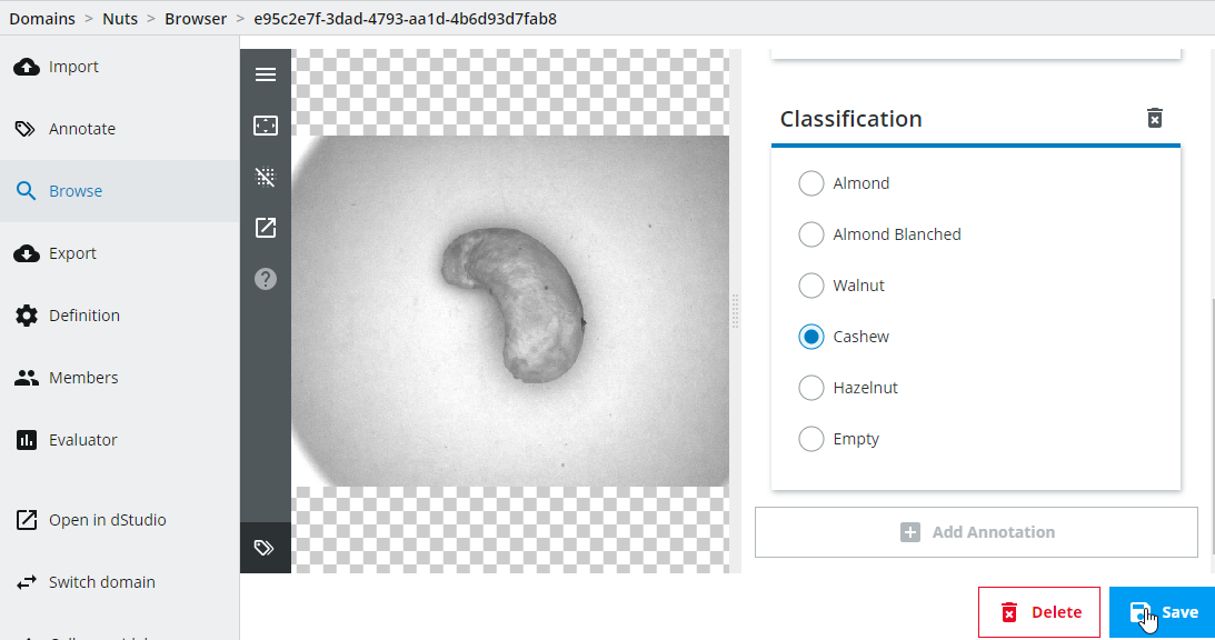
Important: Note that you have to create a new snapshot and retrain the network every time you change annotations if you want to incorporate those changes.
For more information regarding how to interpret the confusion matrix, please see the details below.
The Evaluate view - an advanced understanding
When training neural networks, the results are not always as expected and this can be due to factors such as camera setup, low-quality or using too few images, training issues etc. In order to know the cause of the issue, we need to know how to interpret the results.
Interpreting the training and evaluation results
A common measure for classification is accuracy, which is the number of correct predictions divided by the total number of predictions, i.e. a percentage number where higher is better. Another measure is the "loss", which is the function being minimized during the training (lower number is better). During dStudio training, an accuracy graph and a loss graph is provided (the latter under in the Advanced header). We will focus on how to interpret the accuracy graph.
As we have already seen in the Training in dStudio part of this tutorial, you will see two graphs for the accuracy during training, one for the training data-split and another for the evaluation data-split (there’s also two graphs for the loss under the Advanced header). The reason for having both the training and evaluation splits is because there is a small risk that the network memorizes the training images instead of learning the concepts of what actually distinguishes the different classes (this concept is known as overfitting). By using an evaluation data-split (i.e. images not used during training) you can be more confident that the network will perform well and generalize on new data, if the evaluation graph has high accuracy. In dStudio, the annotated data is automatically split into 80 % for training and 20 % for evaluation.
The graphs will usually be lower in the beginning and unsteadily increase during training. The reason for occasional drops in performance is due to how the training is performed and is in general nothing to worry about. Overfitting can usually be observed as a good accuracy metric on the training data, and a bad accuracy metric on the evaluation data.
In general, it’s also advisable to do further evaluation after the basic network evaluation is done. It’s customary in traditional machine vision applications to qualify a system with thousands of images. A deep learning solution should be no different. If the qualification fails it is possible to extend the training data set with difficult examples and retrain a new network. Hopefully to satisfactory results.
Deep dive: The confusion matrix
Instead of just looking at the overall fraction between correct and total number of predictions (the overall accuracy), it might also be interesting to know how the network confuses the different classes with each other. For example, consider the case where you have an imbalanced dataset, 1000 images of class A, and 3 images of class B (having such a large class imbalance is not a good idea also for other reasons than this topic). If the network predicts all samples to always be of class A, the accuracy would be over 99 % which could be interpreted as "I can classify my images to class A and class B correctly more than 99 % of the time" but in reality the model has a 0 % accuracy predicting images of class B.
With a confusion matrix you can easily display confusions/errors between the different classes in a table-like fashion and find this kind of unwanted behavior. In dStudio, this is shown in the evaluation tab using the evaluation data-split described above. On the y-axis you have the ground-truth annotations and on the x-axis are the predicted classes. This means that the network makes a correct prediction for all the diagonal entries, and errors on the off-diagonal ones. In dStudio you can click on each entry in order to see example images for each case. From this you could gain insights of what confuses the network or to find wrongly annotated images (i.e. the network makes a correct prediction "for real" but since it was annotated incorrectly it is marked as an error).
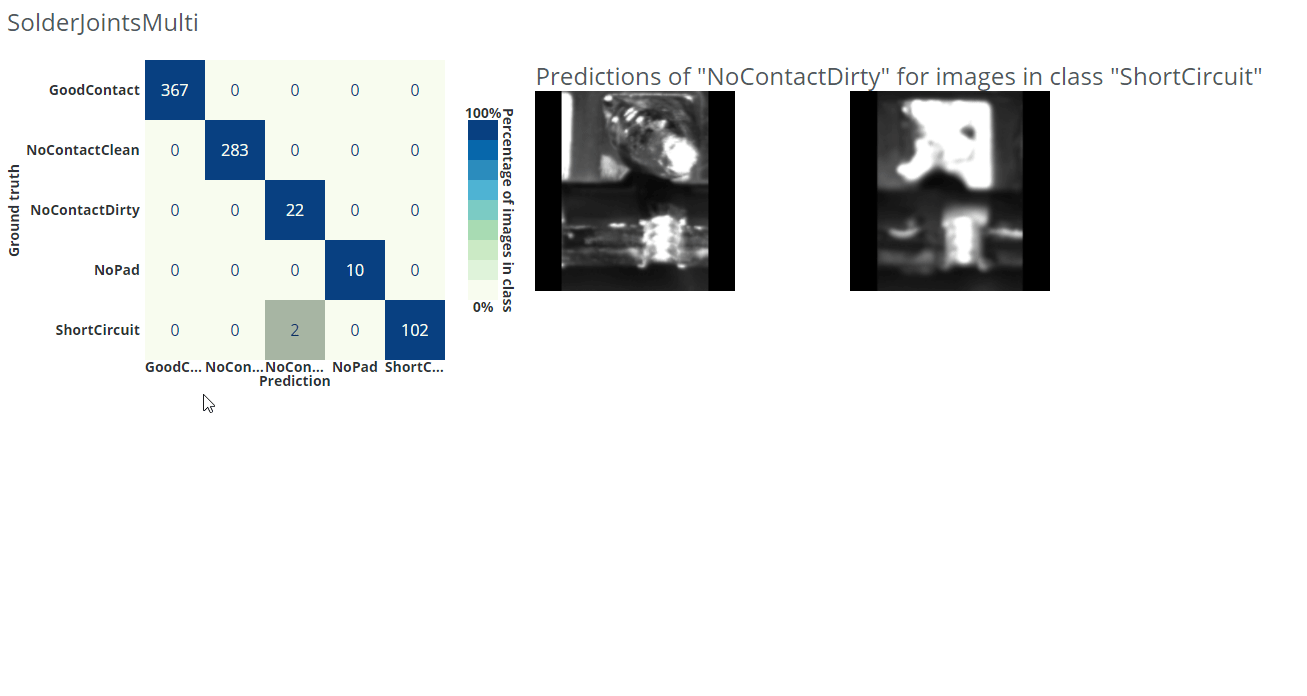
In the example gif below we are using a different dataset for an application where we want to classify good solder joints ("GoodContact") from different kinds of bad solder joints ("NoContactClean", "NoContactDirty", "NoPad", "ShortCircuit").
How confident can you be about your evaluation?
The accuracy shown on the evaluation data can be used as an indication of the accuracy the network will have on other new unseen data, but it’s only an estimate based on the available evaluation set, and therefore not a true measure of the accuracy of a deployed system. To reach a better understanding of the accuracy of a full system, additional evaluation of the system should be considered.
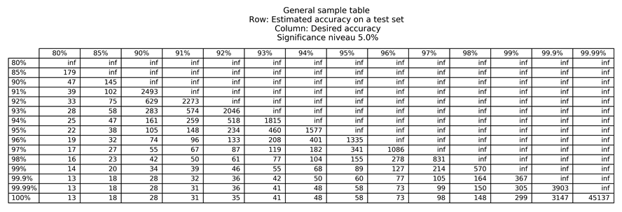
A helpful approach to estimate how many evaluation images you need to determine the confidence on unseen data is to use a significance table. The significance tables describe the least number of images required to say what accuracies you can expect with a certain probability, given that your production inference data is similar to your training data. Please be aware that these are only guidelines and that it assumes that each data sample is equally difficult to classify, and that your test data is drawn from the same distribution as your training data.
Below we have attached two significance tables, for 5 % and 1 % significance. The values in the '5 %' significance table show which accuracies you can expect with a probability of 95 %, and the values in the '1 %' significance table show which accuracies you can expect with a probability of 99 %.
For example, assume that you want your system to be correct 96 % of the time and you have achieved an evaluation accuracy of 97 % during a pilot study. In order to be able to say that the system is correct 96 % of the time, with a probability of 95 %, we need to look in the 5 % significance table, on the row for 97 % (accuracy on evaluation data during pilot study), and the column for 96 % (specified requirement), i.e. this would require at least 1086 more images to test the network performance. If you instead would like to say that the system is correct 96 % of the time, with a 99 % probability, you need to look in the 1 % significance table, on the row for 97 %, and the column for 96 %, i.e. this would require at least 2049 more images to test the network performance.
Important: Note that this is only valid if your inference data is similar to your training data. Unexpected variations in the production inference data will invalidate the significance table as the data is distributed differently.

Training and evaluation troubleshooting
If your network performs poorly during dStudio training and evaluation there may be various causes. Here are some ideas you could try out to improve the results:
-
Make sure the image have high quality and have good lightning conditions.
-
If the interesting part is small or if the background varies, consider cropping out the region of interest in a pre-processing step.
-
Try adding more images.
-
Make sure that there is roughly the same amount of images in each class.
-
Check the wrongly predicted images in the evaluation confusion matrix for erroneous ground-truth annotations or gain other insights of why the predictions might be wrong.
-
Make sure to capture the natural variance in your data (similar looking images give less information than different looking images of the same class).
-
Try a larger network.
Production inference troubleshooting
If your network performs worse during production inference than during dStudio evaluation there may be various different causes. First, we would recommend you to verify that the images look similar during training and during inference. Verify that:
-
a similar camera has been used during data collection and during inference (camera, resolution, lens, flash etc.).
-
the camera is mounted similarly during data collection as during inference.
-
the data has been similarly cropped and resized, or other pre-processing.
-
the object of interest look the same.
-
the lightning conditions are the same.
-
the background does not vary more than the object of interest (in this case consider cropping the object or adding more images).
If the images look similar during training and inference after these checks there could still be deviations that can be difficult to perceive. Try adding images from the new site or setup into your training in order to fully represent the variation in your data.