Evaluating a trained network
Once the training has finished you can access the evaluation tab. Here you can evaluate the performance of the network on the validation set.
The validation set
The data you provide is automatically split into a training (~80%) and validation (~20%) set. The validation set is used to evaluate the performance of the network during training and in the evaluation tab. In the first stage, the network is only trained on the training set. The evaluation displayed in dStudio is done with a version of the network that has never seen the validation data. After the evaluation is generated however, a final training stage is run where the network is trained on all data in your snapshot. This leads to a final network that performs slightly better, but might mean that the score for a given image when running on device might not be exactly the same as in the evaluation in dStudio, which can be relevant to keep in mind if evaluating the network manually later on.Since the anomaly detection assigns a score to each image, the classification accuracy depends on the threshold you choose.
You can see how the threshold affects the performance on the validation set by dragging the dark green threshold line in the graph. Doing so will update the list of images to the left, indicating with icons which images are correctly or incorrectly classified. The numerical value for the threshold is shown in the top left corner of the graph. The orange line in the graph shows the total number of Good images classified as Bad at any given threshold, while the red line likewise shows the number of Bad images classified as Good for any given threshold. The optimal threshold, calculated on the dataset during training, is marked in light green.
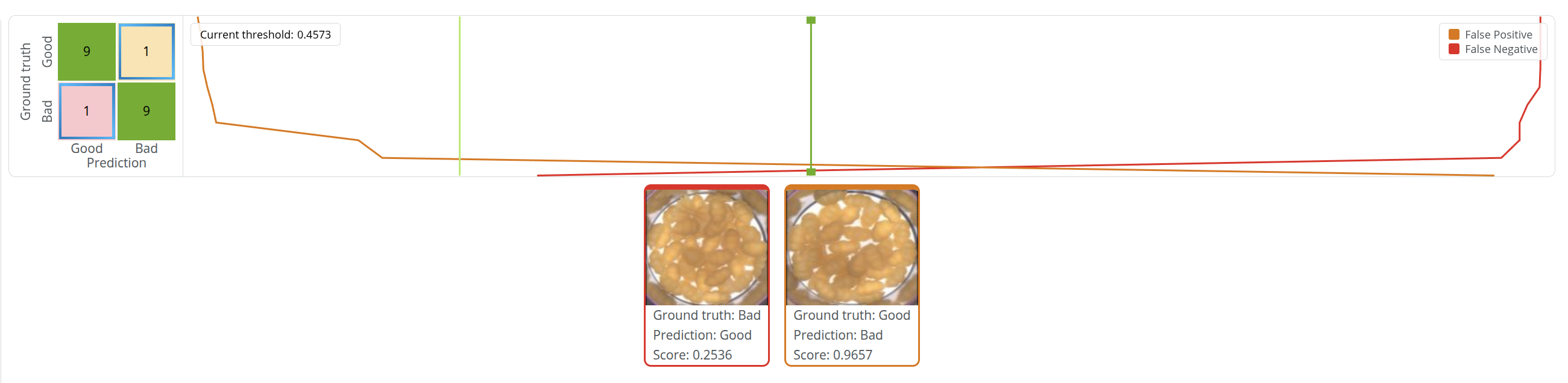
As the threshold changes, the images in the evaluation shift between the different cells of the confusion matrix to the left of the graph. The numbers in the cells indicate how many images are classified a certain way, and the colors help indicate the classification status: green for images correctly classified as they were labeled (both true positives and true negatives), orange for Good images classified as Bad (false positives), and red for Bad images classified as Good (false negatives). Clicking a cell in the matrix toggles displaying its images in the image grid below the graph. The images in the grid have borders with colors matching those of the graph and the matrix, to indicate which cell they belong to.